

Background
Our favorite local grocery store launched a mobile app for customers which was a welcome addition to our library of useful apps. Like everyone else, we spend time shopping for groceries so the app was something we quickly adopted and began using for our weekly refills and sometimes daily fresh sushi and salad runs. Our experience with the app inspired us to explore what more we could envision so we spent some time developing concepts and feature ideas we hoped to pitch to a potential new client.
Project Work
For the design concept, we started by learning as much as we could using the existing mobile app and asking if some additional mobile native features made sense to include in its feature set. We built a few core user scenarios, or stories illustrating how we might interact with our grocery store based on our own shopping and mobile usage patterns. Often, a few key scenarios are all that is needed to launch a successful mobile app that users will find useful, so we kept the list short, focusing on essentials.
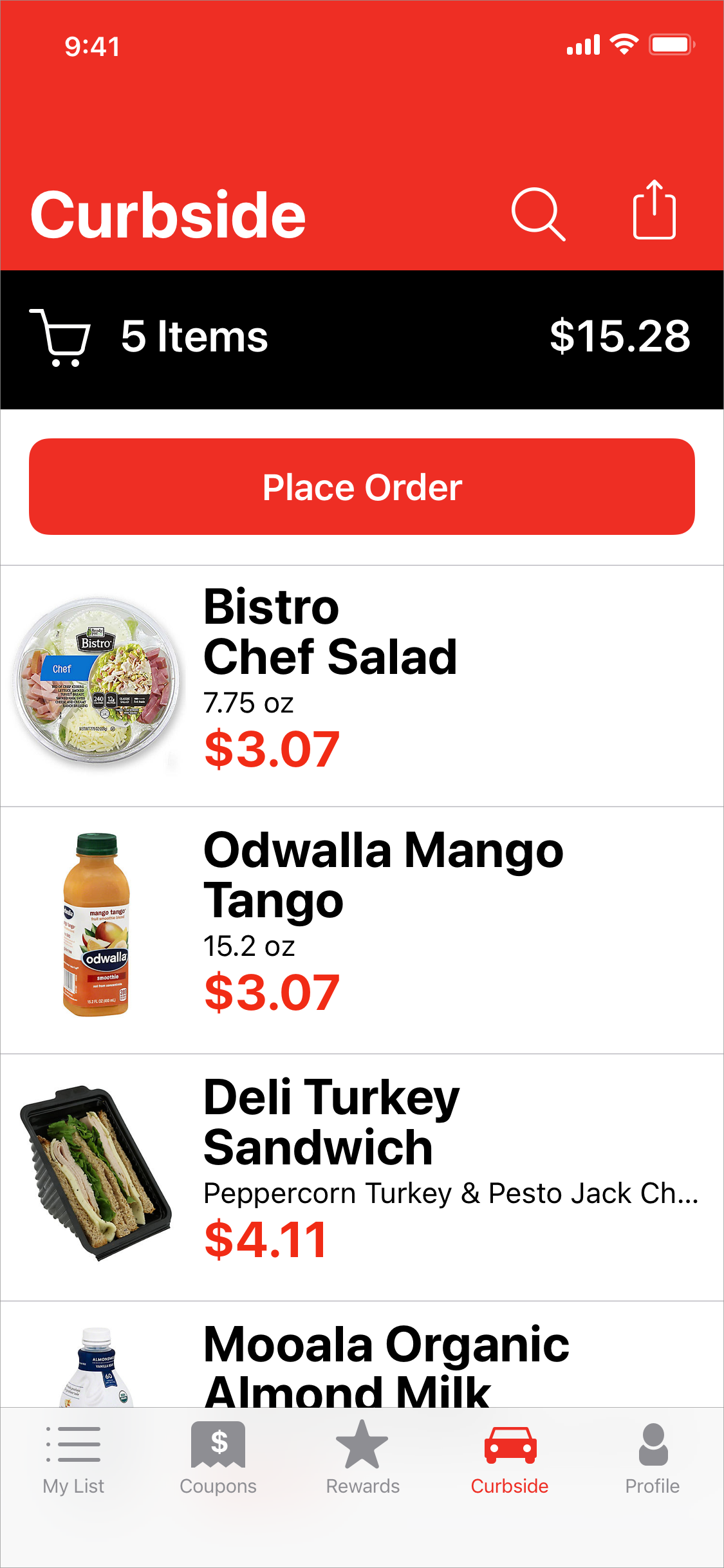
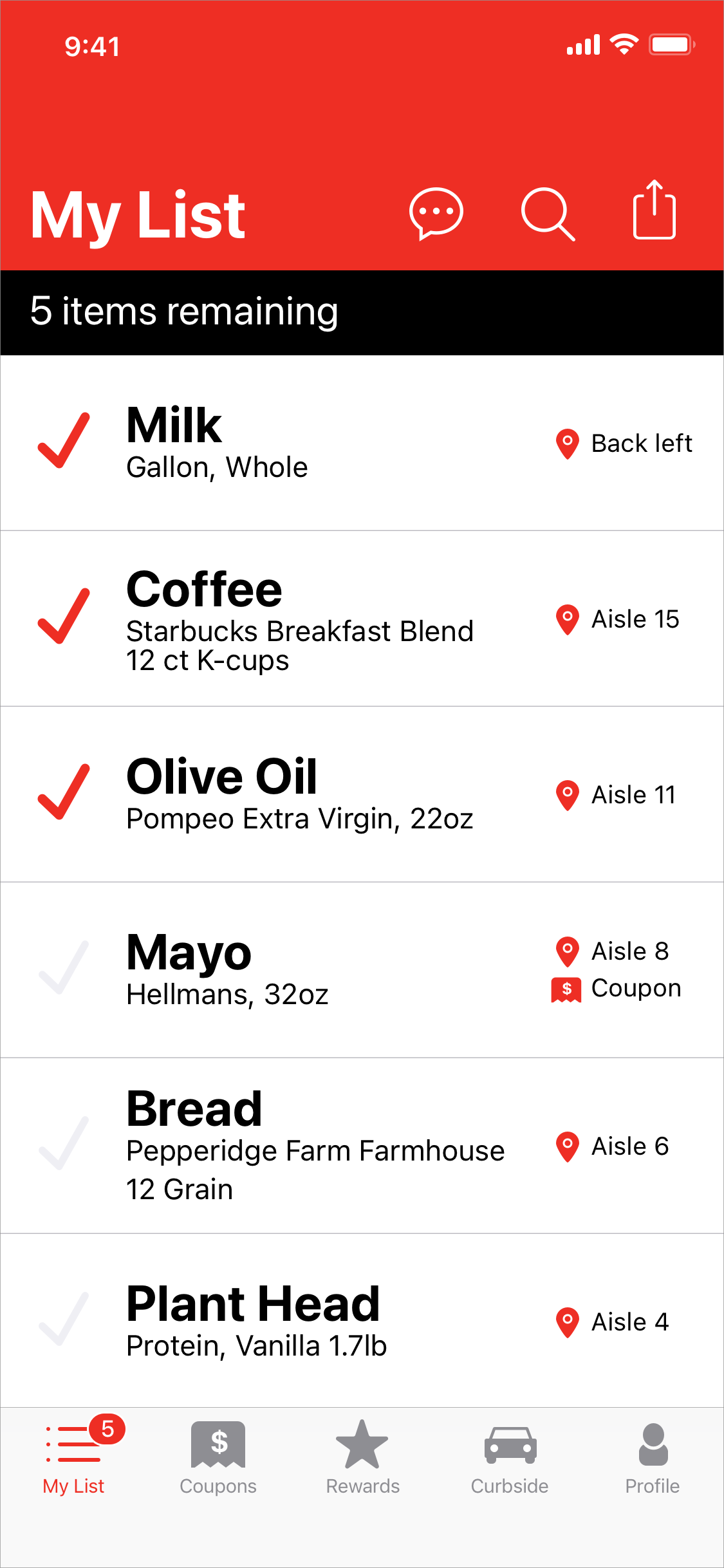
The pillars in the design concept revolved around taking advantage of mobile technologies to connect the shopper to store experiences and stay updated on order status. Just-in-time in-store popup promotions using geo-fencing, location, iBeacons, and real-time push technology was one way the concept strived to improve customer awareness of specials, coupons, and rewards for loyalty. QR Code scanning has been around for a while and users are more skilled at using their phones to follow QR Code links. Getting product info or requesting help on an aisle through scanning location specific codes or even in-app messaging became an idea we felt had benefits to contribute to the design concept.
From there, we pursued a visual design that made use of simple branding, large and heavy text styles, clean UI layouts, and ample amounts of whitespace. It should be quick and easy to scan lists and see the important information most needed while getting through busy store aisles. We iterated our ideas with the goals of removing elements in the design that were not important, avoiding clutter and distractions while guiding the user down the happy path. We call it scrubbing the design which is often one of the hardest things to do as it requires discipline and courage to toss out things you put time and effort into. Early and frequent user testing helps reduce wasted effort and designs that miss the target. We do this using agile and lean design practices that iterate between building, measuring, and learning.
Our final work on this design concept was an experience flow or storyboard that included screen designs and presenter notes for the potential client to consume and build understanding of the ideas we were pitching.

Let’s get in touch.
We look forward to helping you realize success. Send us a quick email about your project needs or questions and we’ll be glad to reach out to begin talking with you.
info@tminus5.dev